Snack Cart POS
Why an ESP32-S3
I picked the S3 because I wanted headroom — for driving the screen and for having enough processing power left over that I wouldn’t be fighting the chip the whole build. WiFi was non-negotiable too; I wanted an interface where the owner could log in, verify payments went through, and adjust prices and inventory without touching the device itself. The S3 is probably overkill in some areas, but at this scale the cost delta between “just enough” and “plenty of headroom” is a couple of dollars, so it was an easy call.
For the screen I just picked a cheap, big display. 3.5“ ended up being the sweet spot — it’s not an exceptionally crisp panel, but it does the job well for a few dollars.
Touch → buttons
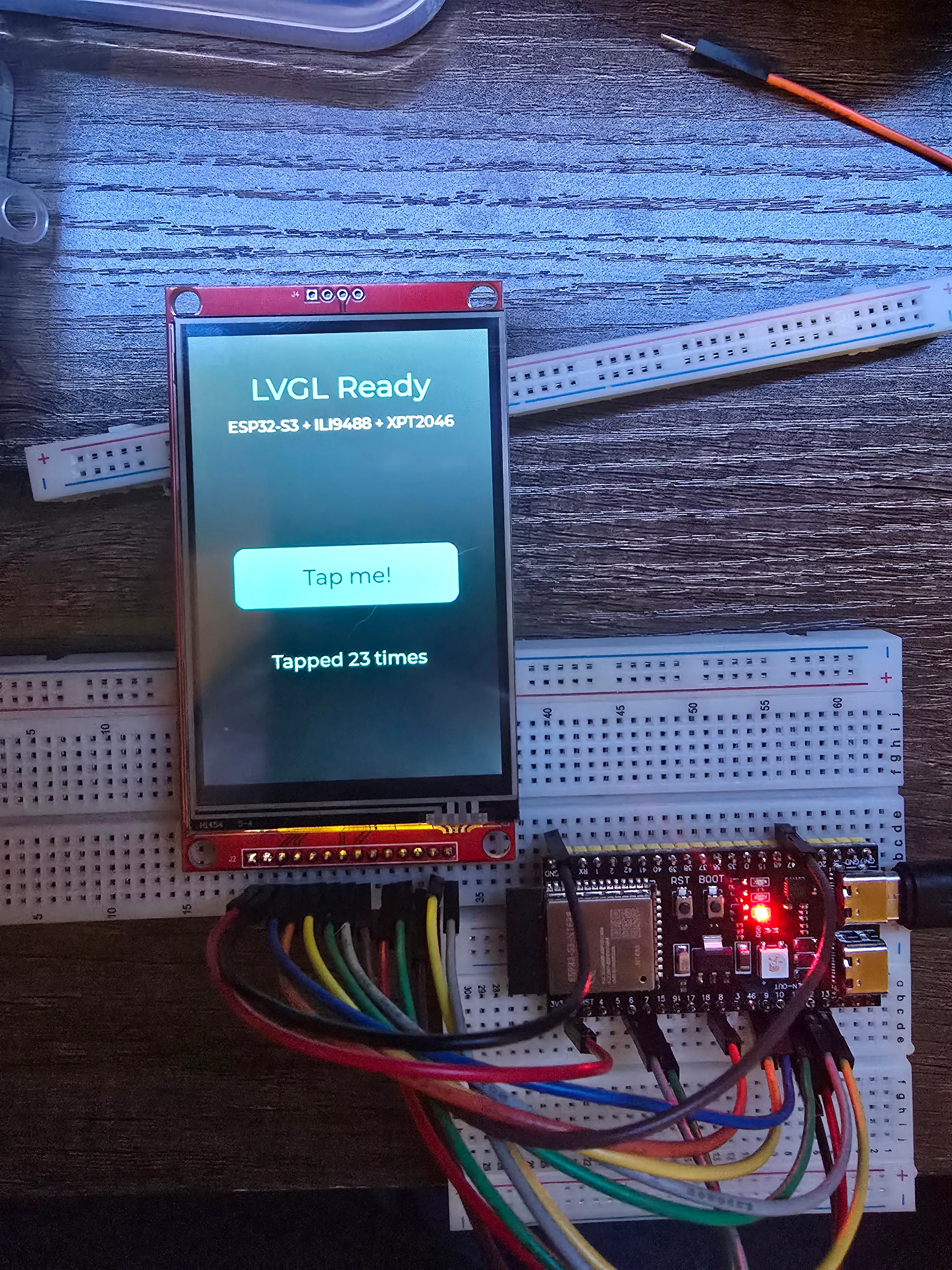
I originally planned to drive the whole interface off the touchscreen. It was calibrated, wired, and working on the breadboard — and it felt bad. Tapping a resistive touchscreen is sluggish and imprecise in a way that’s fine in a demo and grating on the fiftieth snack of the week. For something meant to get used dozens of times a day by people grabbing food on their way past, “fine in a demo” wasn’t the bar.
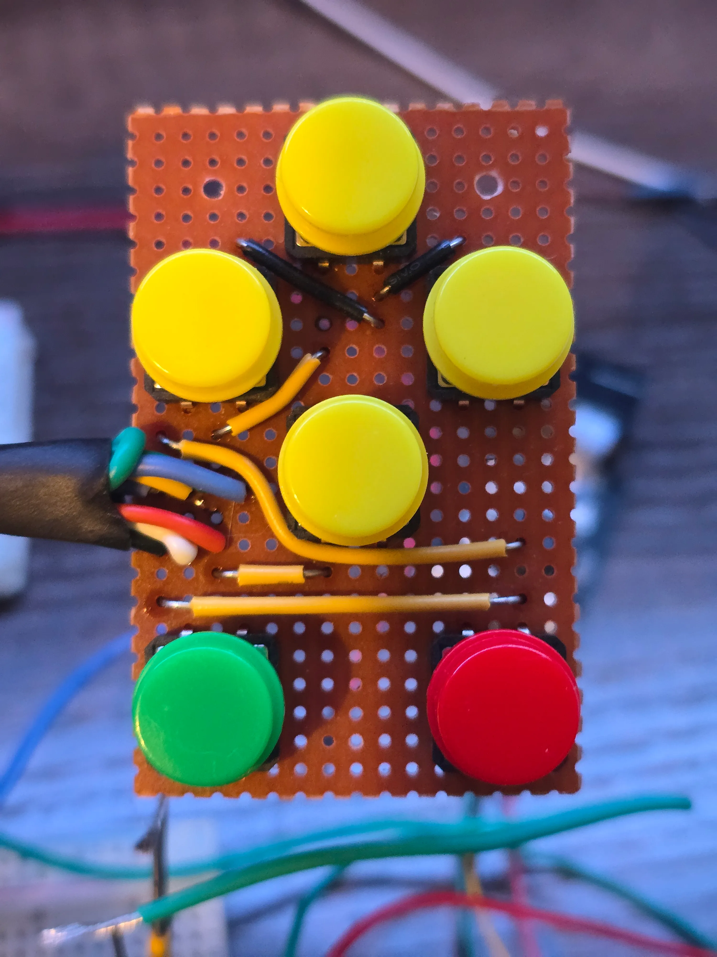
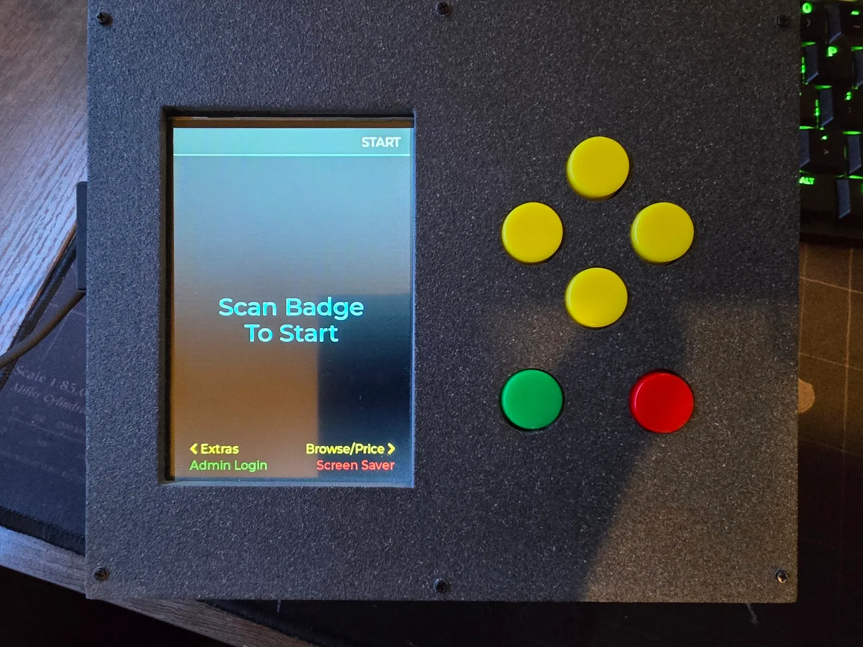
So I ripped the touch driver out and replaced it with six physical buttons — up, down, left, right, enter, back — color-coded so each one’s job is roughly readable at a glance. Every screen registers its own idea of what those six buttons do. More wiring and more code, but it feels like an appliance now instead of a fussy toy.
The database moves to an SD card, and changes shape
The database first lived on the ESP32’s internal flash, with SQLite in WAL mode because that’s the fast one. It worked right up until it didn’t: random crashes and hangs on write. WAL leans on file-locking behaviour a small flash filesystem doesn’t really provide — SQLite’s fastest journal mode, assuming things about the filesystem underneath it that just aren’t true here. The fix was a real SD card (the display module already had a slot on the back, so wiring it was basically free) and the plain old rollback journal: slower per write, but this thing gets unplugged and carted around, so crash-safety beat speed.
The move forced a rethink of the schema too. The obvious first design was one row per item scanned. Simple, and wrong the moment you try to reconcile payments against it: Venmo settles a whole checkout at once, and two checkouts by the same person can land on the same dollar total on different days, so “match the payment by amount” is ambiguous by design. So it’s one row per checkout, with its own transaction number, and a separate table for the items inside it. Nothing ever gets deleted, so “lifetime total spent” is just a SUM() over everything — correct by construction, instead of a running counter that can quietly drift out of step with reality.
Two bugs that weren’t in the code
Turning on the full 16MB of flash sent the board into a boot loop after every upload. The board definition silently assumes 8MB, so the upload tool was writing an 8MB-shaped bootloader next to a partition table whose offsets only make sense at 16MB. The build had been told about the 16MB; the upload step hadn’t. Setting it on both, and switching to a built-in 16MB partition preset that ships pre-paired with a matching bootloader, ended it.
The second one was worse. For months the firmware provably worked — screen lit, buttons responded, flashing succeeded — with zero serial output, ever. Everything about that points at the monitor or the tooling. The cause: this board’s USB port is wired straight to the S3’s built-in USB-serial peripheral, not through the separate bridge chip most dev boards use. A build flag that’s correct advice for boards with a bridge chip was pointing Serial at two physical pins with nothing connected to them. One flag, flipped, and months of silence ended.
Making the buttons feel right
Debounce and repeat timing went through several rounds of me guessing a “reasonable” number and it still feeling like a double-tap machine. What actually fixed it wasn’t a better guess — it was temporary logging that printed real press and release timestamps, then pressing the buttons like a normal person and measuring. A deliberate press holds noticeably longer than the usual assumptions bake in, which is exactly why every value I’d tried still registered one press as two. Tuned against the real numbers, the buttons went from cheap-feeling to snappy.
The checkout screen, finally
For a long time the actual point-of-sale screen — the one thing the whole device exists to do — was a stub. Building it out showed it wasn’t four separate screens, it was one state machine: scan items onto a running receipt, then branch off into cancel, a manual item lookup, or payment. Nothing touches the database until the sale is confirmed. Walk away or cancel before that and the whole cart just evaporates, on purpose, so a cancelled transaction never leaves a row that needs cleaning up later.
My first pass at “add an item without scanning it” was a numeric keypad — key in a price digit by digit, like an old cash register’s price override. It was dead within the same session, before it touched hardware. The real need was simpler: pick the item off the same catalog list the price-check screen already shows.
The other real lesson came from watching someone else try to use it. The person running this cart day to day isn’t going to reverse-engineer a button layout from spatial intuition. The fix wasn’t smarter icons — it was saying it outright: a legend along the bottom of every screen spelling out what each button does right now, in that button’s actual color. Delete stopped silently removing whatever got scanned last and started moving a visible cursor, so “delete” always means the row you’re looking at.
The screen looked “off” the moment it lit up for real
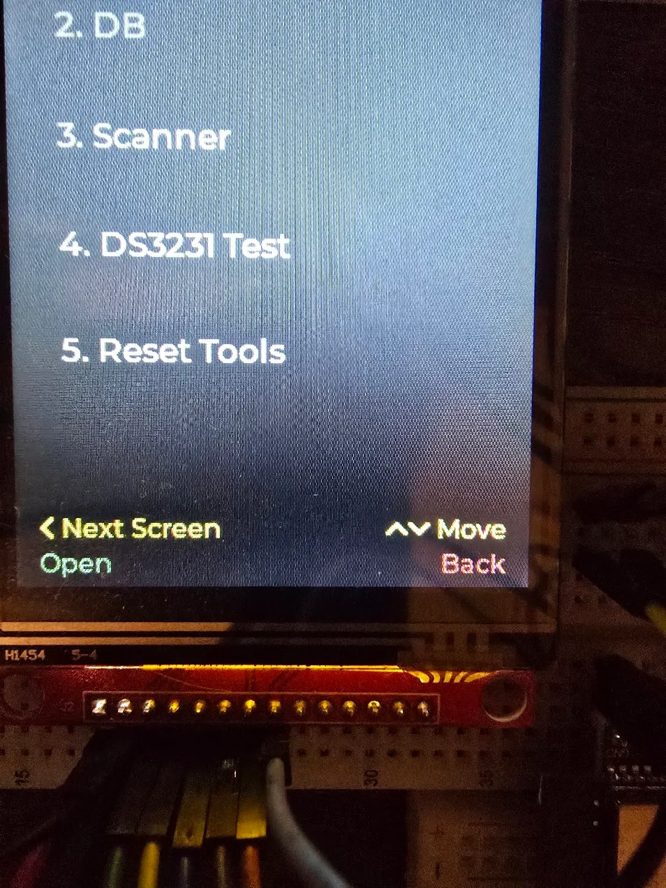
Every colour in this build was picked on a laptop, against a mockup, months before any of it touched the actual display. On real hardware the “black” background read as blue-black, the green looked like pastel mint, and the red for “cancel” was closer to salmon than a stop sign.
None of those colours were ever actually neutral or saturated — they’d just never been looked at outside a code editor. The “black” was #1E1E2E, which genuinely has more blue in it than anything else; invisible as three hex pairs, obvious as a wall of pixels. The green and red were soft accent colours doing a job that wanted bold and unambiguous. Pay is green, cancel is red, no room for “that’s more of a salmon, I think.” Swapped to a neutral grey and a plain traffic-light pair, and every colour decision after that got made the same way: build it, then actually look at it.
Keeping real names out of the firmware
Once real people had to exist in this system — the cart owner, badge numbers, a Venmo handle — the easy path was typing them straight into the source. It’s a personal project, there’s no team, it would’ve worked immediately.
It’s also the wrong call. A name baked into firmware ships inside every compiled binary, sits in the project’s history forever, and comes back every time the device gets reflashed regardless of what’s changed in the real world. The database already lives on the SD card, so people live there too, entered on the cart itself. Right before the source went into version control I swept it one more time and found exactly one leftover offender: a little dev tool for loading test data, still doing the thing it wasn’t supposed to, justified by “there’s no other way to get this onto the device yet.” That had stopped being true weeks earlier, so the whole tool came out. When the repo eventually went public, the only names in it were Jane Doe and John Smith.
The QR code Venmo’s own app wouldn’t scan
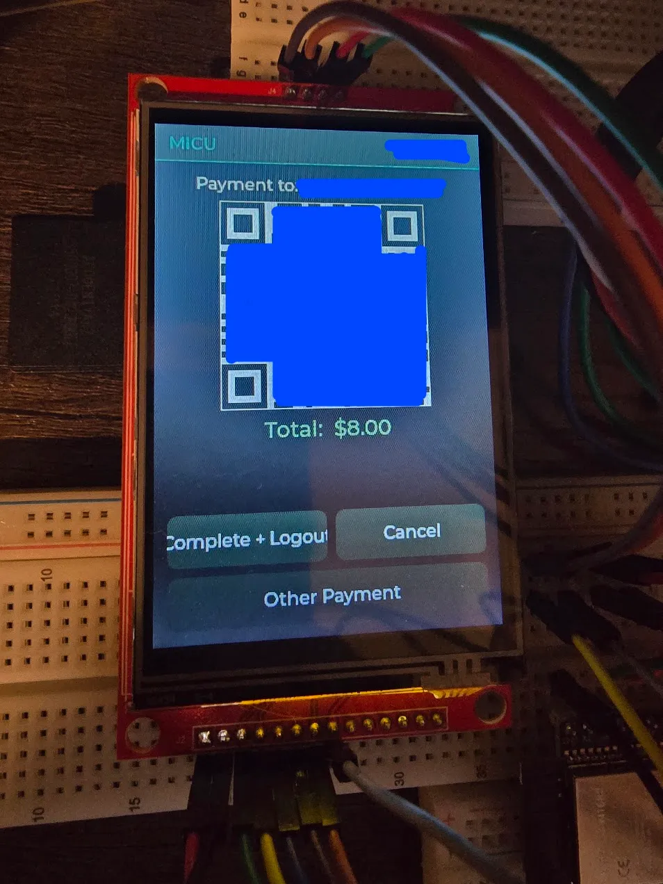
The first real end-to-end payment test hit a genuinely funny snag: Venmo’s own built-in scanner didn’t recognize the cart’s QR code at all. The link inside it was completely correct — right handle, right amount — which made it more confusing, not less.
Turns out Venmo’s in-app scanner only recognizes another Venmo user’s own profile QR, not any QR that happens to contain a valid Venmo link. A plain phone camera has no such restriction: it reads the link and hands it to whatever app claims it, which is Venmo. Scanned with the camera instead, it went straight into a pre-filled payment, correct amount, correct recipient. There’s now a small reminder under the code so nobody else has to rediscover that the hard way.
Reverse-engineering the scanner one wrong guess at a time
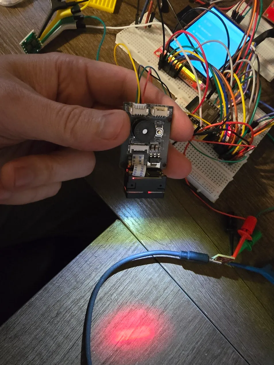
The barcode scanner speaks its own small binary protocol, and there was no usable manual to start from — the first copy I found was a scan of a printed page with no searchable text. So the starting point was someone else’s open-source library: close enough to change real settings, wrong often enough to be a hazard.
The buzzer was the first tell. Turning it on and off worked — backwards. The setting the library called “on” was silent; “off” beeped. Then settings that read back correctly would quietly revert to factory defaults with no obvious trigger. A firmware reflash looked like it preserved them, until leaving the cart unplugged for a couple of hours proved otherwise: resetting the microcontroller doesn’t cut power to the scanner next to it, so every reflash had been lying to me about what a real power loss would do.
The breakthrough came from a tiny QR code silkscreened onto the scanner’s own circuit board for the factory’s tracking. It pointed at the real manufacturer, whose actual manual explained everything the borrowed library had backwards or missing — including a “save to permanent memory” command the library never implemented at all. It would keep paying off: months later the settings screen confidently reported values I knew were wrong, and the manual’s own worked example showed why. Every reply comes wrapped in a four-byte header, and the code had been reading the wrapper as if it were the setting. The fix was a single number: skip four bytes, not zero.
Getting the scanner to mind its own business
Once the scanner was wired it had an obvious new problem: it’s always watching, so its light and aiming laser fired at anyone walking past an idle cart. The instinct was a small hardware switch to cut its power. A documented “deep sleep” command looked like the same result in software, right up until waving a hand in front of the supposedly sleeping module snapped the light straight back on. It wasn’t asleep, just idling with a more promising name. The real fix was a setting I was already using that controls whether it’s watching at all — flip it off on the screensaver, back on when it wakes. No new parts, nothing to solder.
That held until there were a dozen more screens — admin menus, settings, games — none of which cared about a scan, and all of which left the light on anyway. Worse, a stray scan on almost any of them fell through to the front screen’s “look up this badge” logic, so wandering into the wrong menu with a badge in hand could yank the device into somebody’s checkout. Every screen already runs through one shared function to register what its buttons do, so that function now also decides whether the scanner should be listening, and only actually tells the scanner when the answer changes. While building that, one more trap turned up: the scanner sends a little acknowledgment a few milliseconds after every on or off command, and the old code only mopped it up in one direction. Left alone, the “off” reply would have landed on an admin menu and been mistaken for somebody’s badge.
Making the admin side safe to walk away from
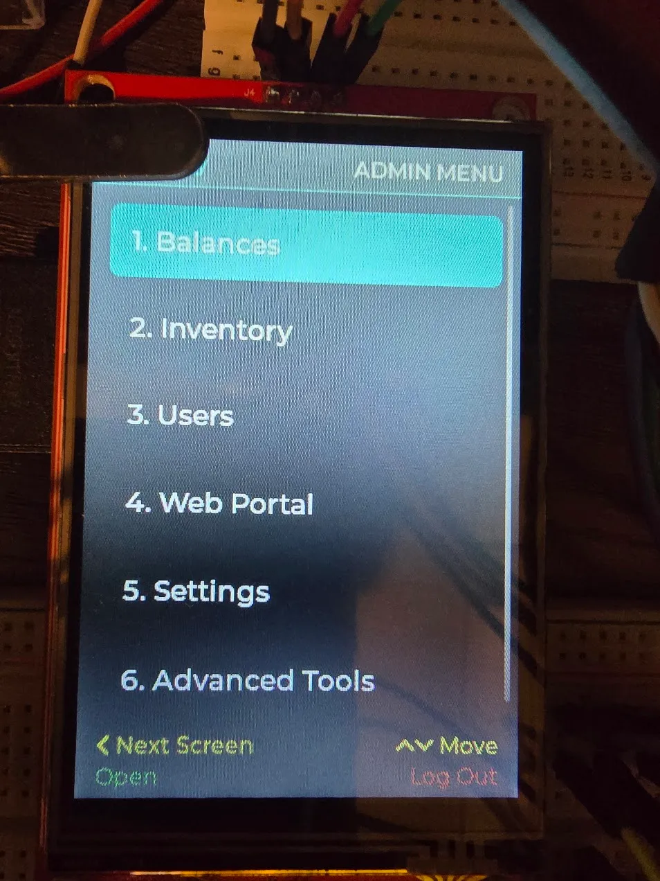
Scanning an admin’s badge used to jump straight into the admin tools, every time — which sounds convenient until you notice an admin could never just buy a snack. Admin access became its own deliberate step: press a button, then scan. Walking away logs out on its own.
The menu itself outgrew a flat list, so it became six folders — Balances, Inventory, Users, Web Portal, Settings, Advanced Tools — instead of an endless scroll or shrinking text back to unreadable. Lists sort alphabetically now; people sort by first name, because the owner knows every nurse on the unit personally and thinks of them by first name. And one snag worth remembering: the plan was a screen to edit a person’s name, admin flag, status, and balance. Balance has never been a stored number — it’s the sum of whatever transactions haven’t been marked paid. Making it editable would mean a second balance that can drift out of sync with the real one. It shows on screen, calculated fresh, and you clear it a transaction at a time.
Giving the screensaver fish somewhere to swim
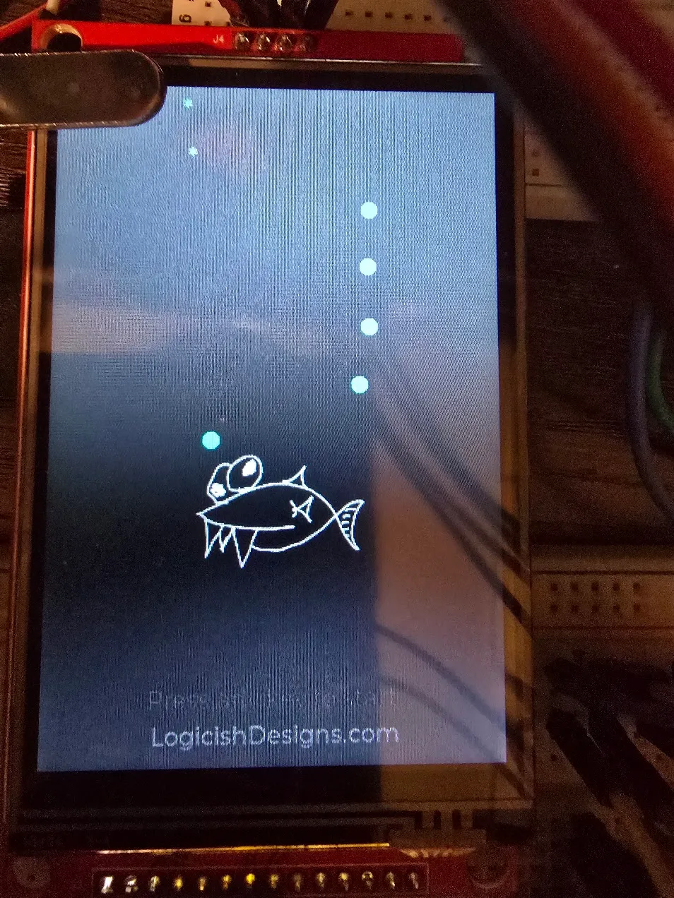
The screensaver fish “dances” — it flips between facing left and right on a fixed sixteen-beat pattern, which reads as endearingly awkward, like it can’t decide which way to go. It also did all of this rooted to one spot. The dance was charming; the stillness underneath it wasn’t. So it got a wander layered on top: every beat it flips a coin on nudging forward, rolls separately to drift up or down, and stays inside an invisible box set in from the edges.
One oddity: work the fish into the bottom-right corner and a thin grey bar appeared along the bottom of the screen. It was a scrollbar. The fish trails bubbles from its nose, and down in that corner a bubble would spawn a pixel past the edge — so the graphics library helpfully offered a way to scroll to it. Nothing there was ever meant to scroll, so the fix was to say so, once.
Turning the WiFi radio off until it’s needed
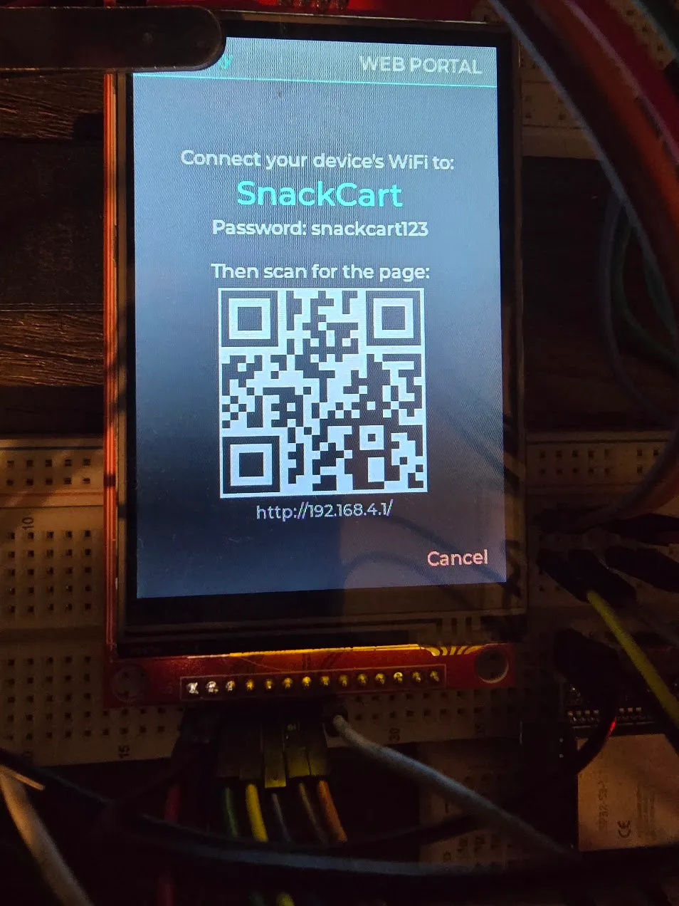
The web portal had been broadcasting its own WiFi network from the moment the cart booted, whether anyone was using it or not. Harmless on a workbench, not something that should ship. The fix was nearly free: the radio stays off until code asks for it, and the only thing asking was one line at startup. That line moved to “an admin just opened the Web Portal screen,” with its mirror image on leaving. The screen shows the network name and password, plus a QR code for the page, so connecting is scan-and-scan instead of typing on a phone. Leave the screen and the radio goes quiet. In practice it comes back up faster than a phone opens its WiFi settings, so it doesn’t feel like a wait.
A stopgap clock, then the real one
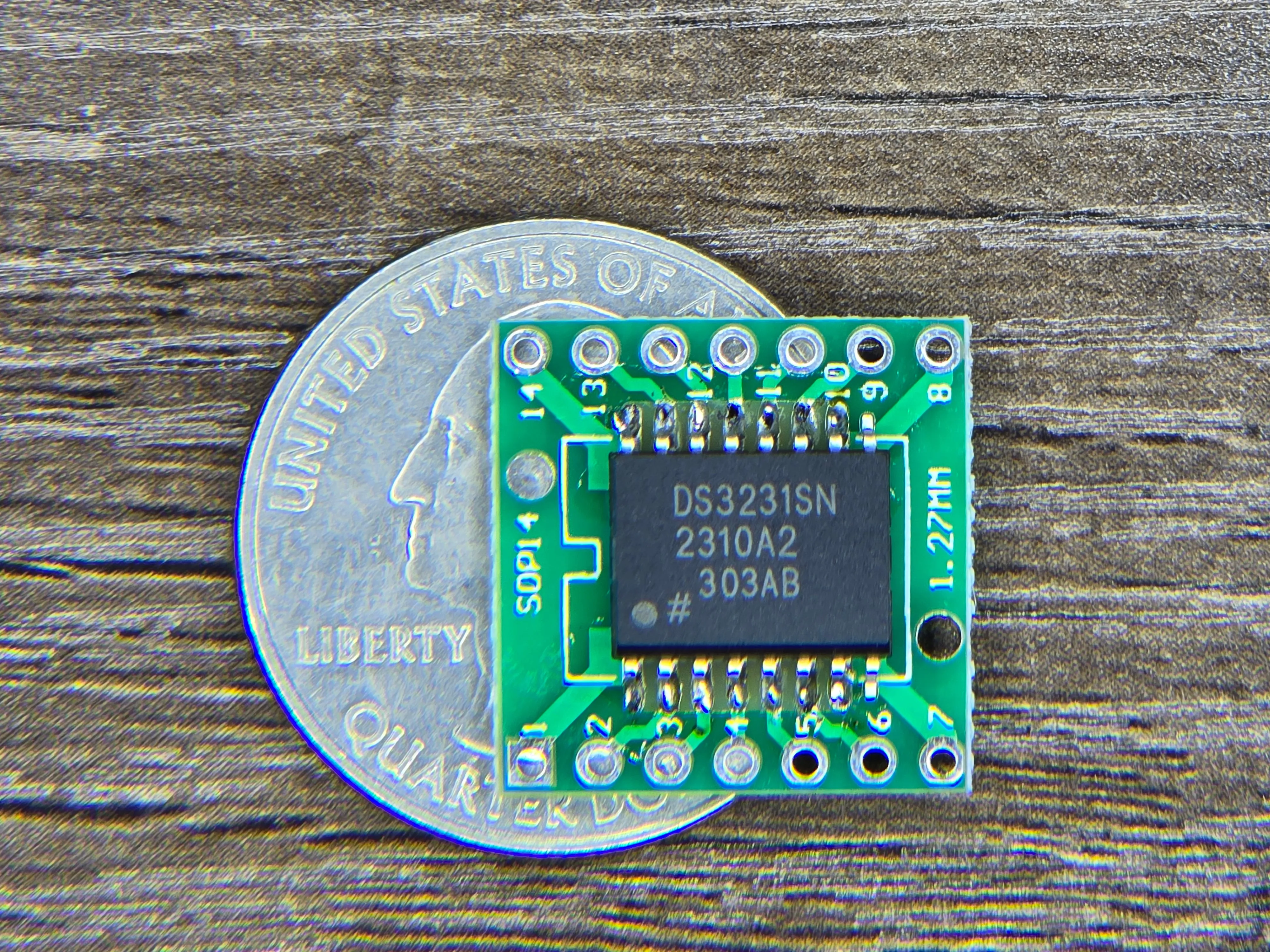
I considered skipping a hardware clock entirely, then pictured the owner going weeks between admin logins with the cart losing power somewhere in there, and decided timestamps actually matter here. I grabbed a DS3231 I had on hand — which turned out to be the wide-body package, and I didn’t have an adapter for it. So it’s on a narrower adapter with a couple of the unused pins overhanging the end. Ugly, works.
Until it was wired, a manual “Set Clock” screen filled in — dial in the date and time by hand — built on the same mechanism the real chip would use, so nothing else had to change later. When the chip did go in, a couple of the planned pins turned out not to be usable on this exact board (one wasn’t broken out at all, the other was already driving an onboard LED nobody had accounted for), so it moved to two neighbours. Then the test that actually mattered: a deliberately long power-off, not a quick unplug and replug. It came back knowing what day it was. The Set Clock screen stayed, demoted from “the only clock there is” to “how you fix drift.”
From breadboard to enclosure
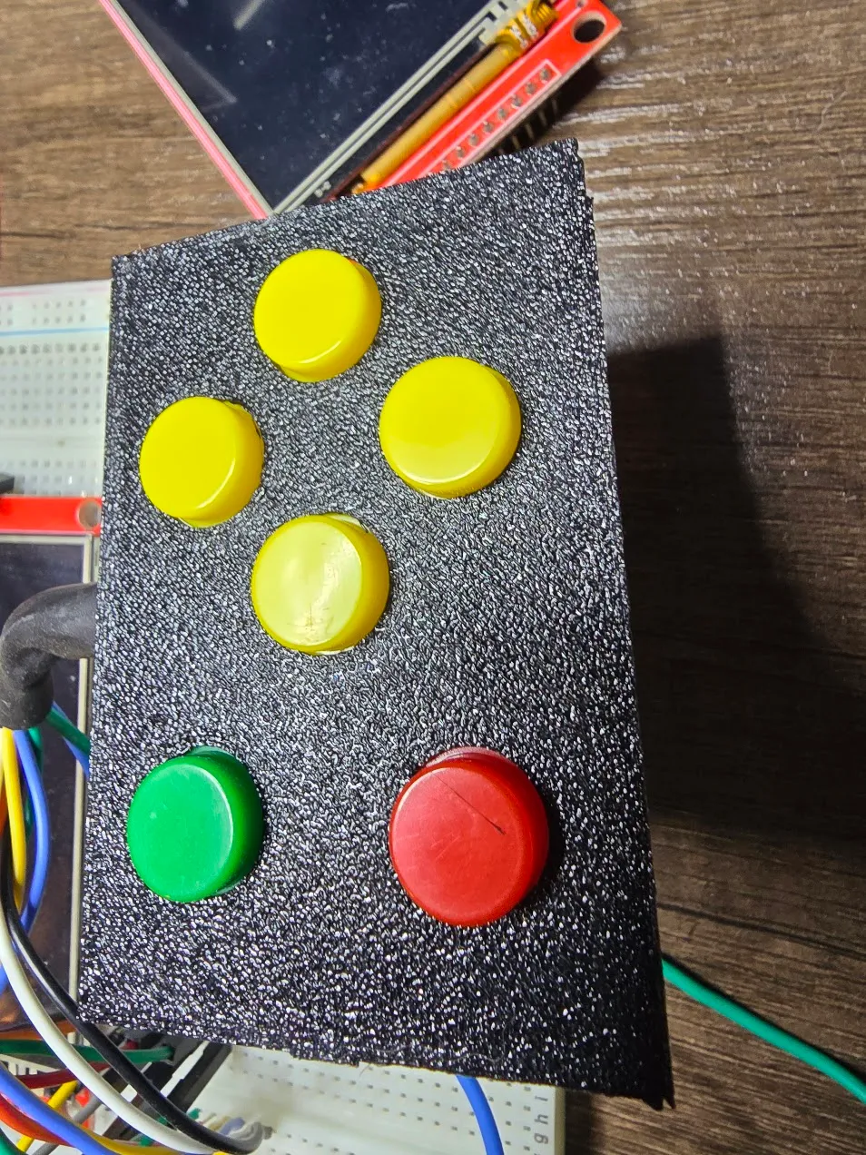
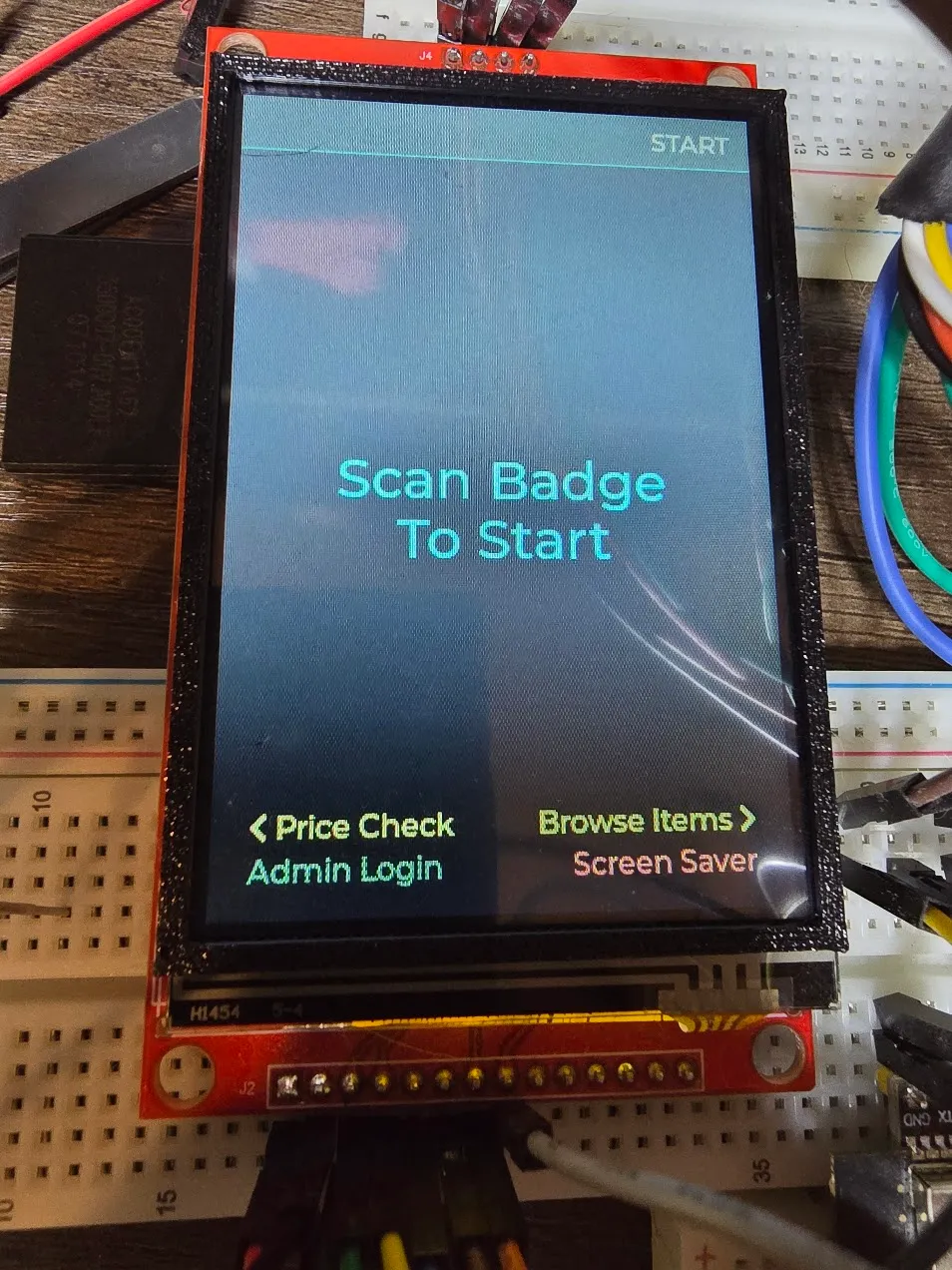
Everything up to here had lived on a breadboard, where a wire in the wrong spot just gets moved. The enclosure started as test fits — a button plate and a screen bezel, printed and textured to check the look before committing to a whole shell.
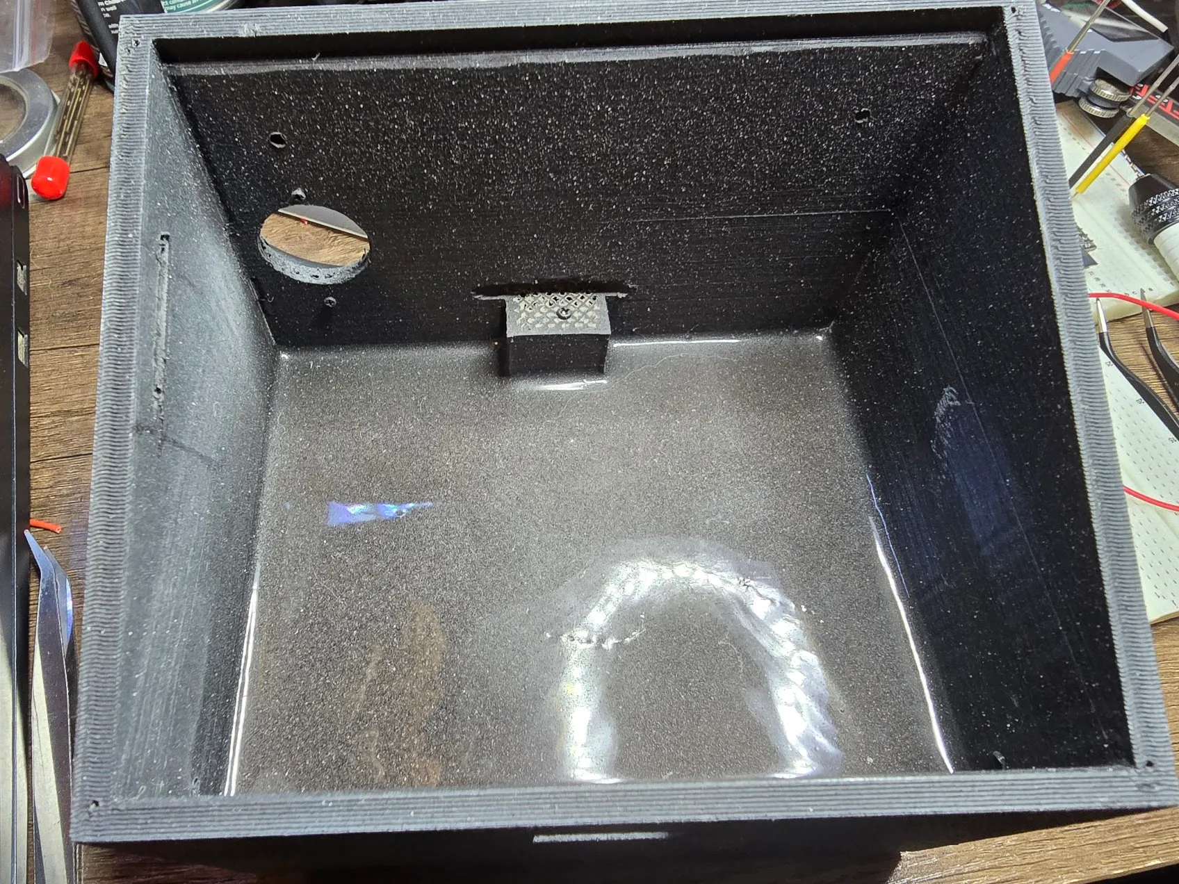
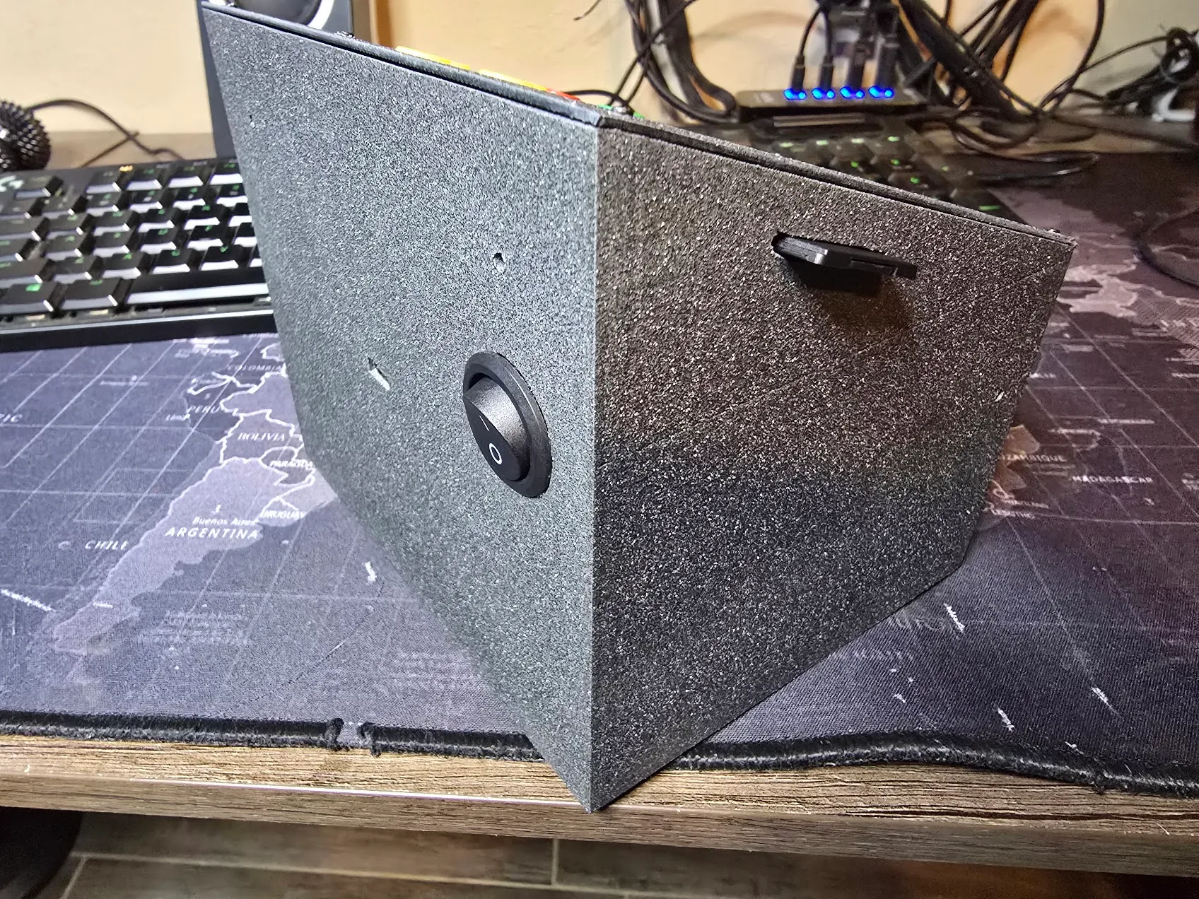
The original plan was a walnut body with 3D-printed bits filling in where needed. What got built flipped that ratio entirely: a fully printed PETG shell, about 350 grams of it. Something with buttons on top gets pushed, so the base is weighted with roughly two pounds of steel shot set in deep-pour epoxy, which keeps it from tipping forward every time someone presses Enter with conviction. Then plastic primer and a textured paint, specifically to hide the layer lines a glossy finish would have put on full display. A side cutout lets the SD card in and out without opening the case, and a couple of vent holes keep the electronics from slow-cooking themselves inside sealed plastic.
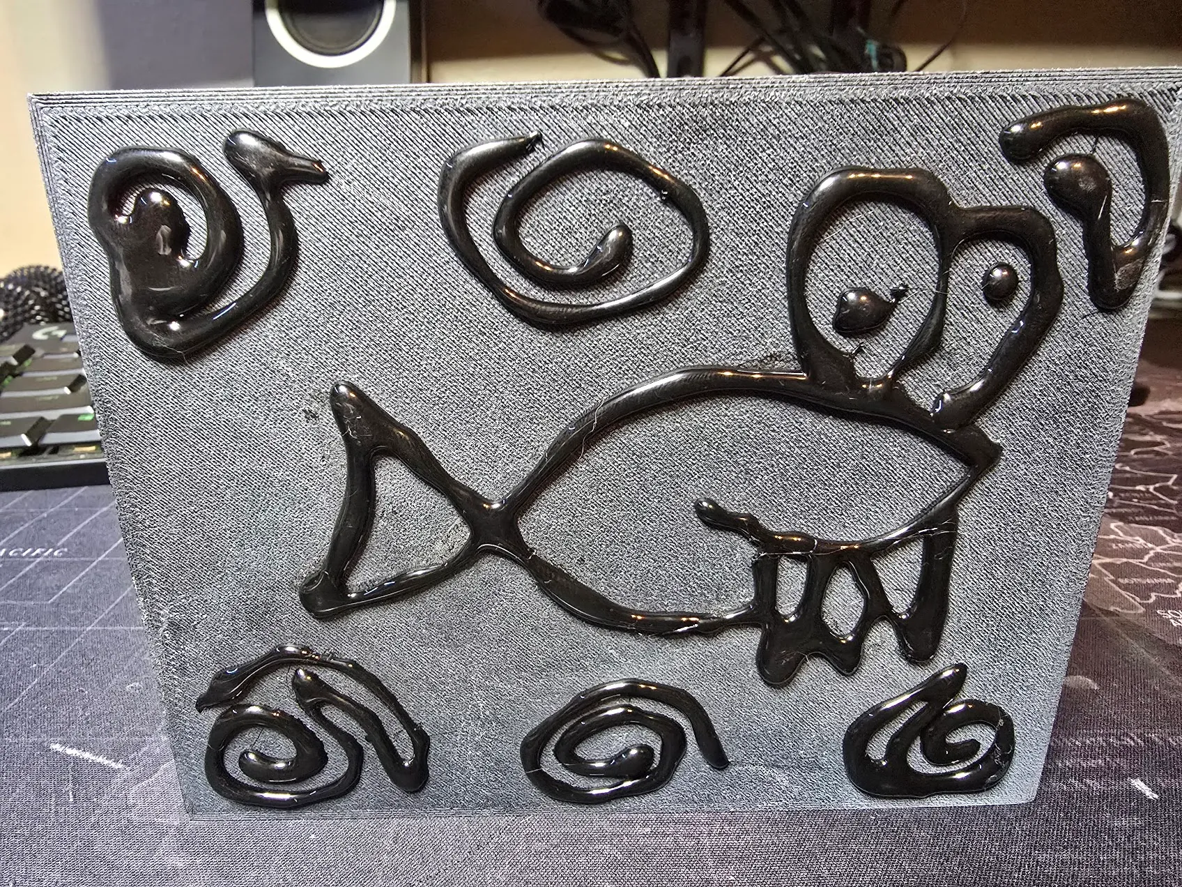
The bottom got feet made of black hot glue, drawn on in lines. It grips better than foam pads, and since it’s just lines of glue, there’s no reason those lines can’t be the mascot fish and a few bubbles. Nobody will ever see it unless they flip the cart over, which is exactly the right audience for it.
Soldering everything for real predictably came out a little different from the plan: the scanner landed one pin over from what the firmware expected, the direction pad came out with up/right and down/left swapped, and the clock line was off by one too. None of it was worth desoldering. Pin numbers are just numbers, so the fixes happened in software. Two new parts went in on the power input: a resettable fuse sized above the worst-case current draw (WiFi transmitting and the scanner firing at the same instant), and a bulk capacitor to soak up those same spikes before they can sag the supply and reset the board mid-sale. Both are sized off datasheet numbers rather than a meter — good enough to build around, and the manual says so.
A screen that couldn’t be nudged
With the case finished, the screen didn’t quite line up with the window cut for it — a few pixels off on two edges. The obvious fix was to shift the whole image over a few pixels in software. It crashed the instant it was tried. The display chip only understands positive coordinates, and the header sits in the top-left corner of every screen, so “a few pixels to the left” meant asking it to draw somewhere that doesn’t exist. The fix that worked was the opposite of clever: don’t move the picture, shrink it. Five pixels off two edges is a sliver nobody will ever notice, and it can’t produce a coordinate the chip doesn’t understand, because it still starts exactly where it always did.
The database library that quietly says no
This one’s a running theme rather than a single bug. The SQLite library that fits on this chip is older than the SQLite most of the world uses, and it has a habit: when it doesn’t support something, it often doesn’t fail. It just does nothing, and reports success.
The first time, a step meant to add a few catalog items silently never happened. The exact same SQL worked on a laptop and did nothing on the cart — the device’s library predates “insert this, or update it if it already exists” as one statement. Then a brand-new “hide this product” feature crashed the cart on its first real test: the step that adds a new column to an existing table had run without complaint, and the column simply wasn’t there. I pulled the SD card and added it by hand on a PC, which worked instantly. Then the first-ever test on a completely blank card found the same missing column on a table that had just been created, which meant a fresh cart would have shown an empty product list forever. That column is now built into the table from day one, instead of trusting the library to add it later.
Number four was the database’s own built-in integrity check, which also quietly does nothing here. Number five came during the very last week: a perfectly ordinary query in the new boot-time data check got refused outright, and the check counted “couldn’t ask” as “found a problem,” raising an alarm on a card that didn’t have a single sale on it. That makes five features this library has quietly declined to support. The lasting change is a reflex: when something touching storage “does nothing” instead of visibly failing, stop debugging the code and go look at what’s actually on the card. The cart now does a version of that itself, logging a warning at boot if a database change didn’t take.
Three ways to pay, and letting the apps do the typing
Venmo had been the only payment option since the first real payment landed. Ship week added Cash App and Zelle, which turned out to be very different problems.
Cash App was easy: its links can carry an amount, so its QR code fills in the total just like Venmo’s. It can’t carry a note, which is fine — payments that aren’t Venmo just get matched by amount and time. Zelle has no public payment links at all; its QR codes are generated inside each bank’s app. People online have worked out the format, so I built one from a phone number. The bank app rejected it, and every published example turned out to use an email, never a phone. Rather than keep guessing, the cart now does the obvious thing: every one of these apps has a “my QR code” screen, so you scan your own code into the cart. For Zelle, the cart stores the bank’s own code exactly as scanned and shows that exact code to customers. There’s no format left to guess, because it’s literally the bank’s own creation. It also means nobody ever has to type a username on a six-button keypad.
The web portal, rebuilt for a phone
The web admin pages were drafted as wide tables of editable boxes — fine on a laptop, miserable on a phone, which is what an admin actually carries. They got rebuilt page by page: one line per product with name, price, stock, and ±1/±10 buttons; tappable on/off pills for admin and active; “Paid? Yes / No” in place when clearing a balance. Reading the old code before rebuilding it turned up real bugs: the five-minute auto-logout fired while an admin was busy on their phone (nobody was touching the cart’s buttons, after all) and then left the WiFi running with the cart back in normal use, and a confirmation prompt on “Clear Selected” was attached somewhere browsers ignore, so it never asked. The web login came out entirely — reaching the portal already takes an admin badge at the cart plus the WiFi password, with the radio off the rest of the time — replaced by one rule: the admin who opened the portal can’t demote, deactivate, or delete themselves, so the cart can never end up with no admins.
The last web feature was downloadable reports, and the obvious format was Excel with proper tabs — on a device with no room for a spreadsheet library. It turns out a modern Excel file is just a zip archive of a few short text files, and zip allows storing files uncompressed, which removes the hard part. So the cart writes one itself, streaming it straight onto the SD card so it never needs much memory, then hands it to the phone: three real tabs, currency formatting, bold headers. The one bug on the way in was that the web server library quietly adds its own “this is a download” header, the cart added a second one, and Chrome refuses those outright.
Extras: a fish that flaps and a box that tilts
The owner asked for games. I don’t know what they pictured, but what they got was a start-screen button labelled “Extras.”
The first one was Laggy Fish, built around a constraint instead of fighting it: this display redraws at maybe ten frames a second, which sinks almost any game, so the game is about steering a sluggish fish on purpose, QWOP-style. Two days before launch a coworker said “Flappy Bird,” and it got torn down to the studs and rebuilt as exactly that. Same fish, same name, same joke. The fish sprite was 120 pixels wide, over a third of the screen, so a script shrank it to 48×32 and thickened the outline back up so it didn’t vanish. Quick taps sometimes didn’t register — the cart only checks its buttons between redraws, and a fast tap can start and end inside one frame — so this game alone gets a hardware interrupt that catches every press the instant it happens. And the lag was uneven, speeding up and slowing down with how much pipe was on screen, so it now runs on its own fixed clock underneath. Still chunky, which is the joke, but the same chunky every frame. High scores save to whoever scanned in, and beating the cart record says so.
A sliding-block puzzle had been on the list early on and got shelved over one question: how do you know a randomly generated board can actually be solved? A shooter called Castle Defense took its slot, chosen specifically because any random board was fair. It never quite clicked, so two days before launch it got replaced by the puzzle after all, with a twist: every press tilts the whole box and every block slides as far as it can at once, like tipping a tray. Get the red block out through the gap. It’s called Slide Free. The tilt turned out to answer the old question too — each press has only four outcomes and everything piles against a wall, so a board can only ever reach a few hundred to a few thousand layouts, and a little Python tool on the PC can visit every one of them in a fraction of a second. Unsolvable boards never ship.
Knowing a board is solvable isn’t knowing how hard it is. “Fewest moves” was the first guess, and it falls apart fast: ten moves with one way through is hard, ten moves with forty ways to win is easy. So I went looking for research instead of inventing a formula, and found Jarušek and Pelánek, who watched people spend hundreds of hours on puzzles like this. Fewest moves works for puzzles where every move can be undone; for ones where it can’t (a tilt can’t), what predicted difficulty was a simulated person who presses fairly randomly when lost and more deliberately as the answer gets close. The tool scores every board that way, plus one thing their puzzles didn’t have: a reset button, which a real person uses the moment things get obviously worse. The boards live on the SD card in five tiers of a hundred, and the cart quietly logs how each one actually goes, so the simulated person can eventually be tuned against real ones.
The fix that caused the bug it was fixing
Ship week opened with a small complaint: opening the item lookup list didn’t just open it, it opened it and immediately jumped down a page, as if the button had been pressed twice. Building that list takes the cart a moment, and the hold-to-repeat timer was counting that moment as time the button was held, then firing a second press into the brand-new screen.
The fix was to start the hold timer after a screen finishes loading. It went out, and the next report was stranger: opening the Users menu now skipped straight past it into “Add User.” The fix compared a timestamp taken before the screen loaded against one taken after, got a negative number, and because of how that kind of number wraps around, read it as an enormous hold. Every press now fired twice, instantly. One missing line fixed both for good. It’s the kind of bug that makes you suspicious of every fix that seems too easy, and rightly so.
The backup that could have erased itself
On launch day the whole codebase got one last full read-through, looking for anything that could hurt after handoff. The best find was in the backups, and it was a quiet one. Every boot the cart copies its database to a backup, and if the database is damaged it restores from that backup. But a database that’s simply missing doesn’t look damaged — the library just creates a new, empty one, which passes every check. Then the routine boot backup copies that empty database over the good one. One lost file and both copies would be gone.
So boot now asks one question before backing anything up: does this database have an admin? A real one always does. That fix led to a bigger one the same afternoon. Boot now reads every row of every table (since the built-in integrity check is, of course, one of the five things that does nothing), keeps five rolling backups instead of one, compares each copy byte-for-byte before it replaces anything, and refuses outright to back up a database that fails. The splash screen just stays up a little longer, so all that paranoia looks like a logo.
Since boot was checking things anyway, it now checks everything else that would otherwise fail silently and writes it to a boot log: why the chip last restarted (a brownout shows up in plain text, which says a lot about whether the power supply and capacitor are keeping up), a dead clock battery, a scanner that never answered, a jammed button, sales whose totals don’t add up, and how long an SD write takes, since a wearing card tends to slow down before it fails. Anything wrong shows as a yellow line on the Admin Menu, where customers never see it.
A manual you can hold
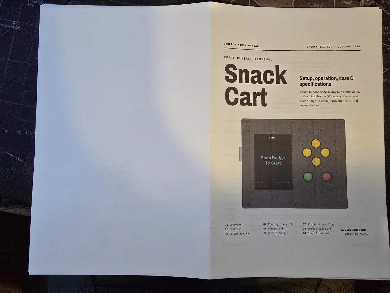
The last thing the cart needed wasn’t code. The owner wanted a proper manual someone else could run the cart from — not two hundred pages, just real documentation. It came out at eleven, written from the firmware itself rather than from memory: every button and screen, every alert and what to do about it, how the backups work, how to recover onto a new card, and a power budget for each state the cart can be in. It averages about a watt, roughly ten cents of electricity a month. Those numbers come from datasheets, and it says so. It’s in the Docs tab.
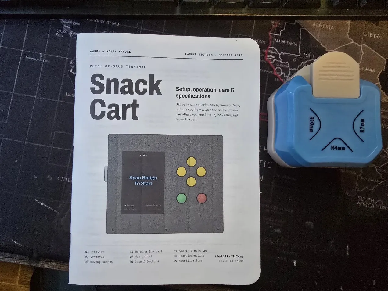
The cover drawing needed one real correction. Its first version was based on the original enclosure sketch: a tall, narrow box with the screen above the scanner. The real thing is a wide, speckled panel held by six screws, screen on the left, yellow diamond of buttons on the right — so the drawing was redone from a photo, which also caught the manual’s own description of the layout copying that same outdated sketch. Same lesson as the very first colour test: look at the actual object before calling it done.
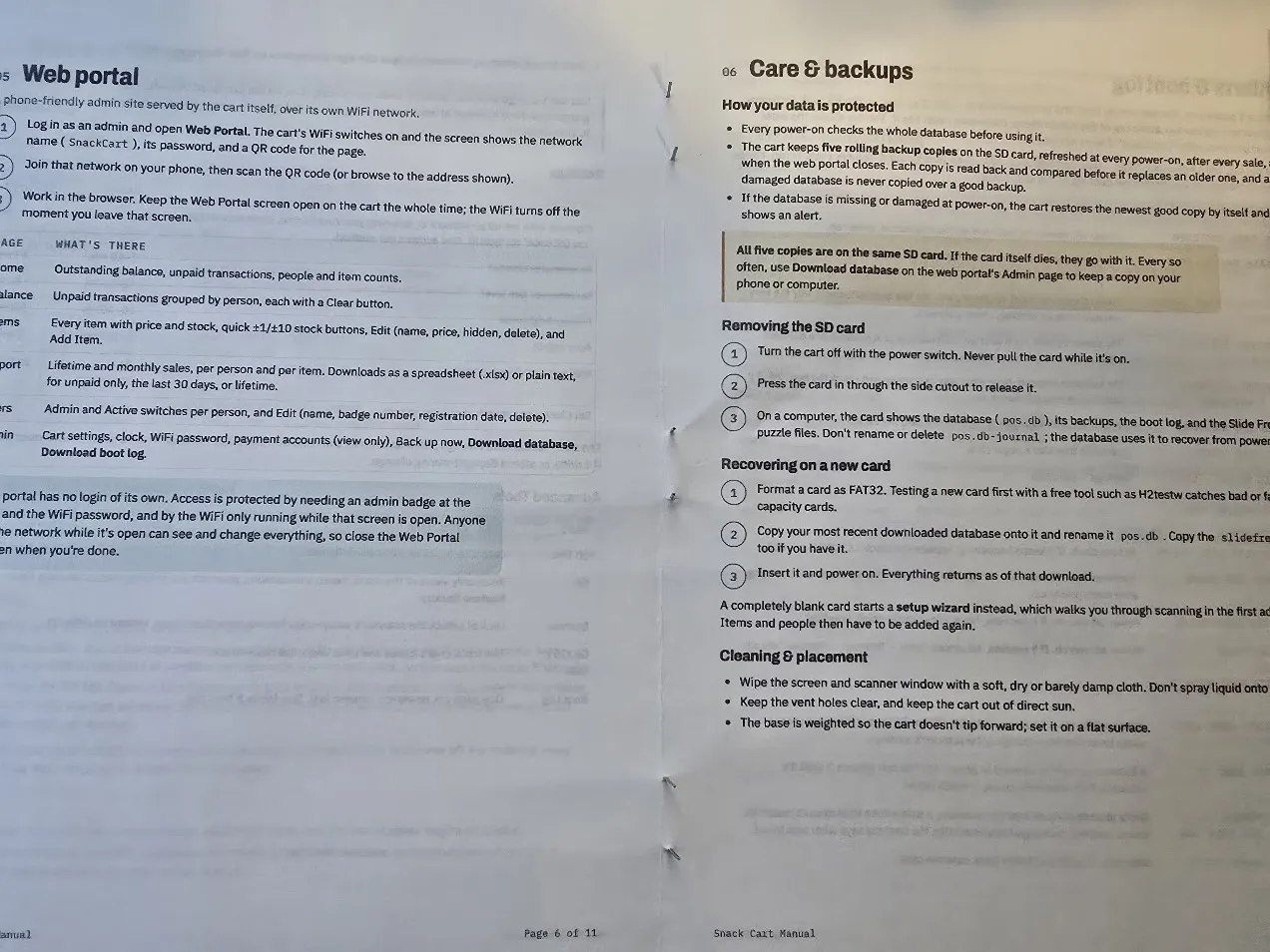
Then it became an actual book: printed as a booklet two pages to a side, folded, and stapled down the middle with three staples. A folded stack never lines up at the open edge, so it went through a paper trimmer to square it off, and a corner-rounding punch finished it.
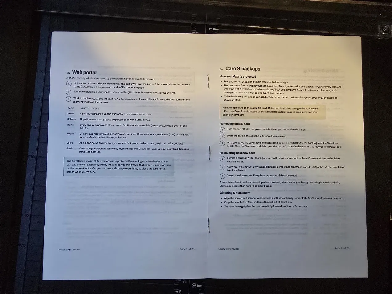
A trimmed, round-cornered booklet sitting next to the cart reads as a finished product in a way a stack of printouts never would.
Launch: where it stands
It launches Sunday, October 4. Scan a badge, scan snacks, pay by Venmo, Cash App, or Zelle from a QR code on the screen.
- It’s been running for a week straight. Pulling the power mid-save lost that one sale and damaged nothing. Pulling the SD card lands on a clear error screen that recovers once the card is back.
- It checks itself every time it powers on — database, clock, scanner, buttons, SD card — keeps five verified backups, and writes it all to a boot log.
- A blank SD card can be set up from scratch on the cart itself, with no computer involved.
- The production card is clean: real people, the real catalog, real payment accounts, and transaction numbering starting at #1.
- The web portal works on a phone, with one-tap stock changes, spreadsheet reports, and a full database download, so a dead SD card is a two-minute recovery instead of a morning of re-entering everything.
- The Extras games are done, high scores and all.
- The scanner’s setup-code feature is switched off, so nobody can reconfigure it by scanning a special barcode.
- A printed manual goes with the cart.
After launch: link barcodes for the rest of the products, count the real stock, take an actual meter reading of the power draw, and someday write the stories for a choose-your-own-adventure engine that got built, then pulled from the launch build until there’s a story worth running on it.
The full source code is on GitHub for anyone who wants to dig in.